I think the easiest and most flexible approach would be to use a presentation rule on the attribute that is displayed in the relevant cell - add a class when certain conditions are met, and use CSS to apply color to the cell that has that class. If you would want to apply the cell color only in some grids but not in others, this can be solved by adding a CSS class to the grid and then specify in your CSS file that the color only applies to the cells within a grid having that class.
But if for some reason you don't want to use presentation rules, you could also define Item display rules for the grid. This enables you to define a particular class for a grid row when certain conditions are met. However, this means that the relevant class is attached to all cells on that particular row, not just the cell that you want to highlight. But that can be solved by removing the class attribute for the other cells through a render script, and leaving the class for the cell for which it applies. This is the approach that I used to dynamically display a red colored box around cells that have an error, for example a negative value in a cell where only positive numbers are allowed.
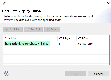
Here is the item display rule defined for the grid:

Here is the render script for the grid:
const grid = widget;

// Attach Kendo grid event handlers
grid.bind("dataBound", onDataBound);
function onDataBound(e) {
    // Check if there are any fields with errors, and update class accordingly
    selectFieldsWithErrors();
}

function selectFieldsWithErrors() {
  // Aware has been configured to add the class .ep-attr-error if State=Failed
  grid.tbody.find("tr.k-master-row > td > div.ep-attr-error").each(function () {
    let field = $(this);
    let cell = field.parent();
    let row = cell.parent();
    let colIndex = cell.index();

// If the row expansion is enabled, then the first cell is a hierarchy cell. Skip this cell.
if (row.children().first().hasClass("k-hierarchy-cell")) {
  colIndex--;
}

let fieldName = grid.columns[colIndex].field;
let record = grid.dataItem(row);
if (record) {
  // Obtain error list from the column sc_ErrorList
  // Create regex from error list, with case-insensitve matching
  // if one of the errors in the error list does not match the field name, remove error class and style
  let errorList = record.sc_ErrorList.toString();
  let errorRegex = new RegExp(errorList, "i");
  if (!errorRegex.test(fieldName)) {
    field.removeClass("ep-attr-error").removeAttr("style");
  }
}
  });
}
And this is the corresponding rule in the CSS file:
td div.ep-attr-error {
	border-color:#ff0000;
	border-width:2px;
	border-style: solid;
}
And here is an example of how this looks in the application (red colored box around the field with a negative value).

The render script above checks whether the field name (attribute) is present in the column with name sc_ErrorList (which is a shortcut). That column is included in the grid but not displayed - a great way to include additional data in the grid without actually displaying it on screen. Using this additional column, I can use BO rules to automatically add or remove field names to the error list and thus control which columns will have the error class. If you know already which particular cell you want to color, you can simplify the code and just remove the style from all other columns.
Note that the classes are updated only when the grid is re-rendered, through the onDataBound event handler. For my purposes, this is good enough.