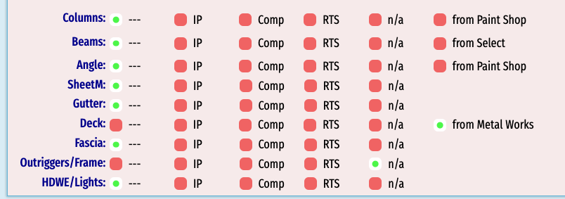
It would be nice to have better control over Radio Button layout on a form.
The radio buttons are laid out in a table.
There's a pixel width for the buttons (you specify this in aware),
and you can specify how many columns as well.
So by simple math, that determines the spacing between each "dot".
(500 pixels total width / 5 buttons = 20% for each column)
This is ok, but when I say "better control", it would be to fine-tune the column size FOR EACH BUTTON to make a prettier UI.
Example 1: (this cannot be done by default)

Aware will make a "messy" layout if you have 1 field with 6 dots, and another field with 5 dots and use the same pixel Width. So you can monkey with that a bit and get close like this:

OK, a good start, but now a lot of screen width used - you can see my "---" and "IP" options are "narrow", so I want to tighten it up like in the first image.
Example 2: (this cannot be done by default)

The longer options like "Shipped to Galvanizer" and "at Paint Shop" wrap around unless you use a lot of screen with (and wasted blank space) to make it not wrap.
The key is allowing us to specify a column width for each column.
width: 4%;...---
width: 7%;...In Process
width: 7%;...Complete
width: 7%;...Shipped
width: 13%;...Shipped to Galvanizer
width: 20%;...n/a
Without this, it would make each column 16.6667% , or 1/6th of 100%